ParentVUE Education App Case Study


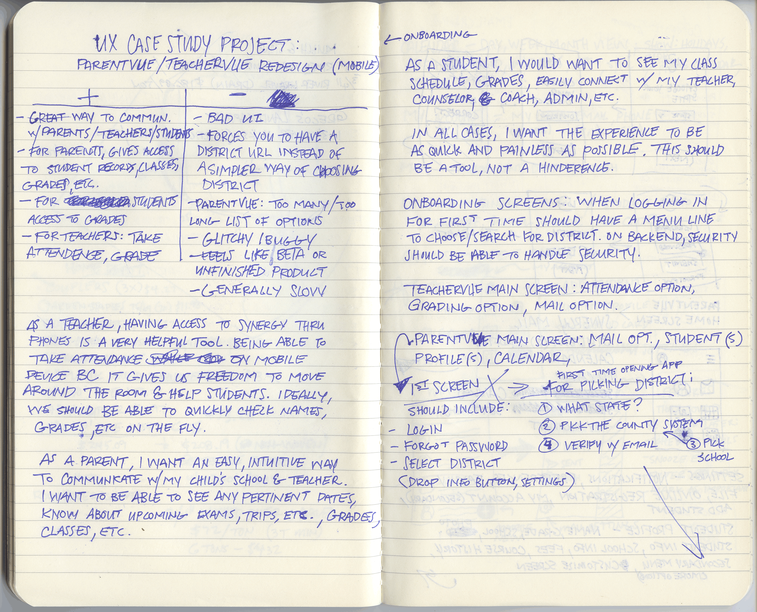


Like many parents, I have come to use Synergy’s ParentVUE to communicate with my son’s teacher, see his class schedule, view the school calendar, and much more. However, ParentVUE feels unfinished, rudimentary, and confusing. From the very first time opening the app, one must have a unique URL that must be used to connect to the correct district. While this makes a certain amount of sense, the problem is that one must know the URL and it is not clearly shared. Once in the app, it is full of menus, sub-menus, a wheel selector, outdated visuals and a confusing UI.
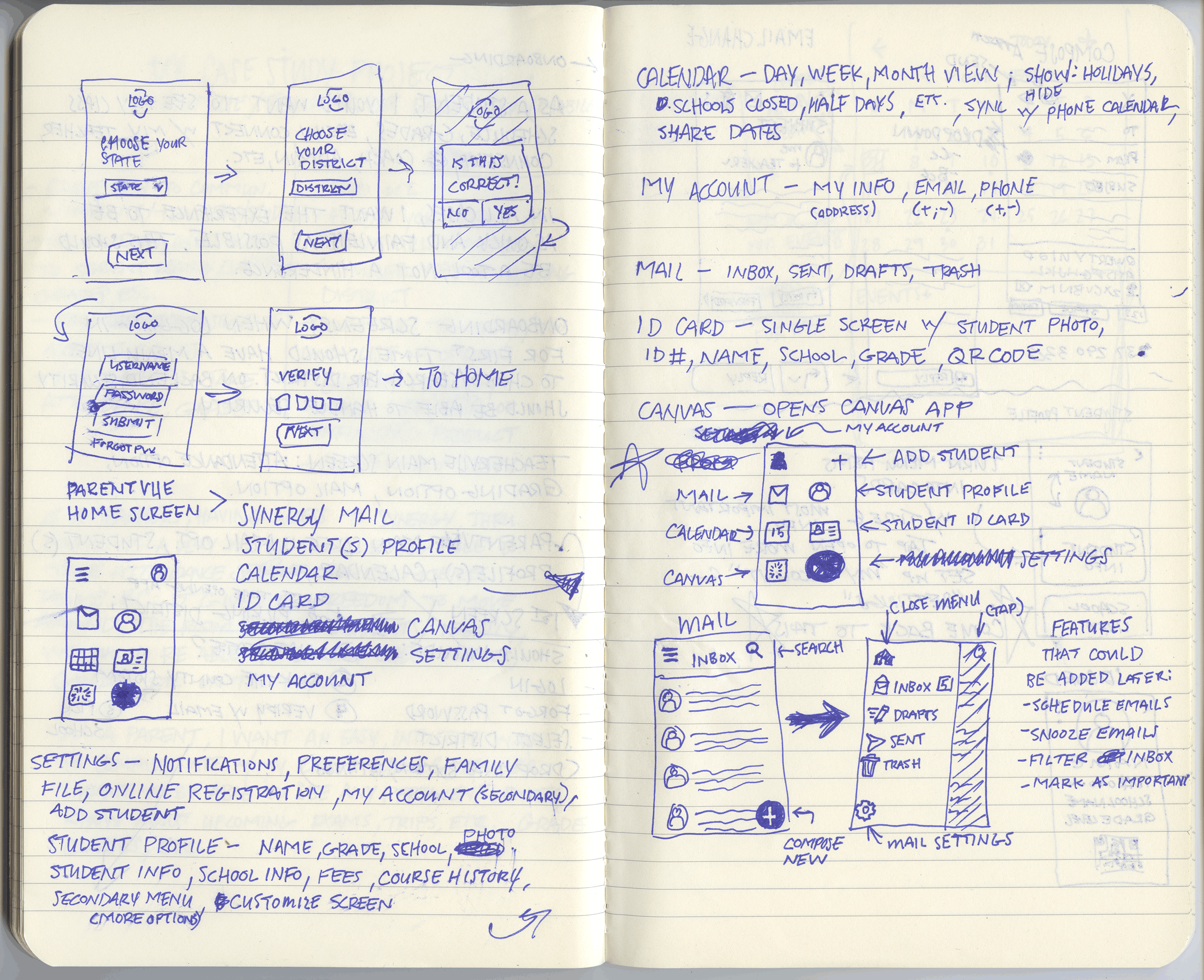
I began by creating a mood board to show some of the screens that are useful and have potential, however need work. I included some of my notes and early hand-drawn wireframes to show my thoughts and process as I work out user flows and general layout and hierarchy. I looked at this app from both a parent and a teacher as I use Synergy in that capacity as well. I decided to take on ParentVUE only as it has more to offer parents but needs a lot of work, in my view.
Onboarding was the first instance I wanted to update and reshape. As I said, there is a special URL that is given but it is easily missed or forgotten. Having dropdown menus to easily choose the state and school district would make it faster and easier for parents, especial those who English may not be their first language, get into their account. Once there, you can login using your email and a password, which would be in the school district’s system already through initially registering the student. Login is then verified using a 6-digit code emailed to the chosen email account. This would be a screen one sees typically on the first time they use the app and from there, would be able to see their login, giving them the ability to open the app right to the Home Screen.
In the end, I wanted to deliver a powerful tool that is as useful as it is easy to navigate. ParentVUE has the potential to connect parents to their students’ classroom, teachers, and their overall success. With this updated design, both teachers and parents will find that the potential for communication, transparency, and collaboration has been realized. The focus is now put back on the success of the student and we as parents can be more active and aware of our children’s education.

Click or tap to view prototype
Grocery & Recipe App Case Study


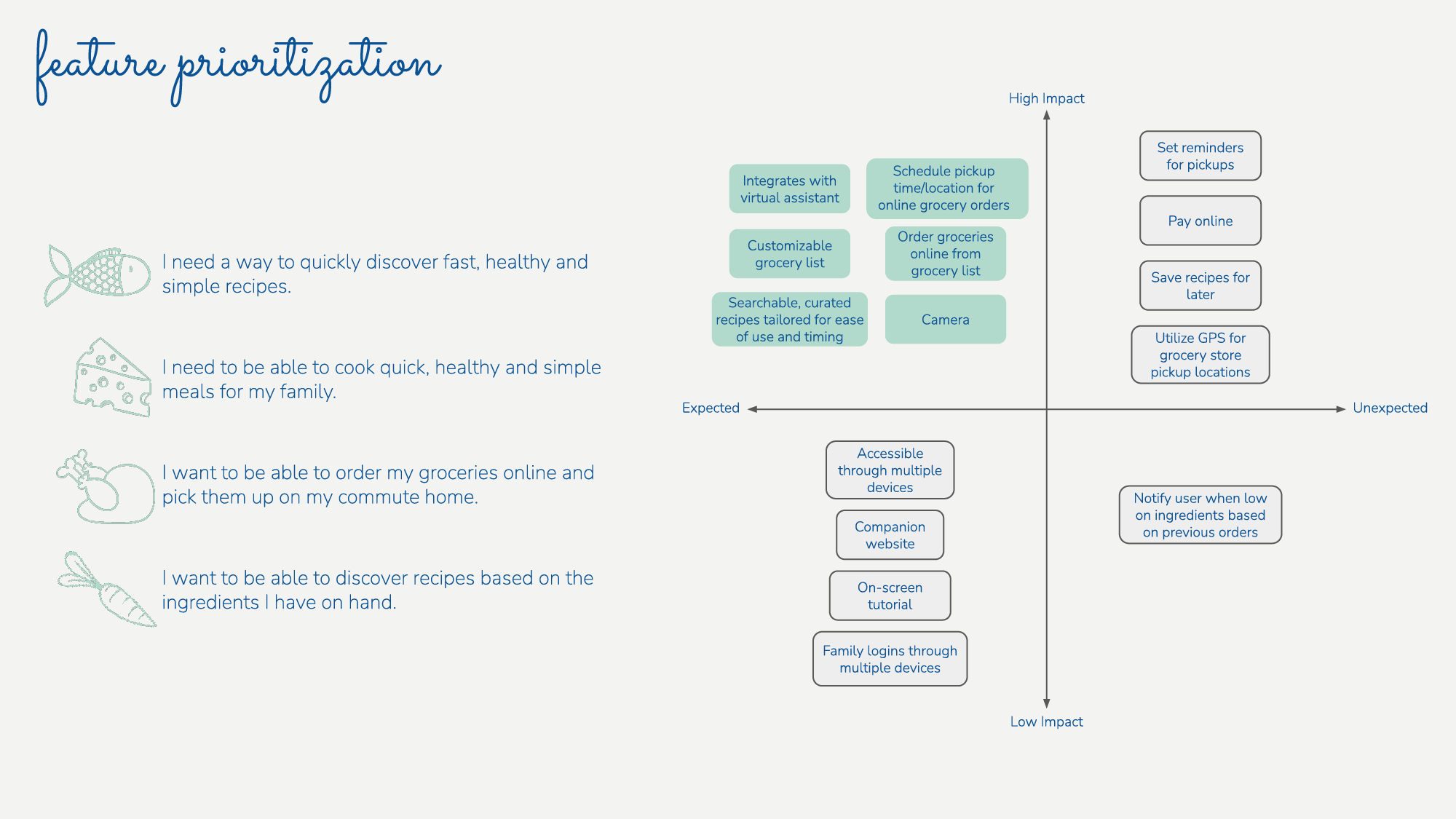

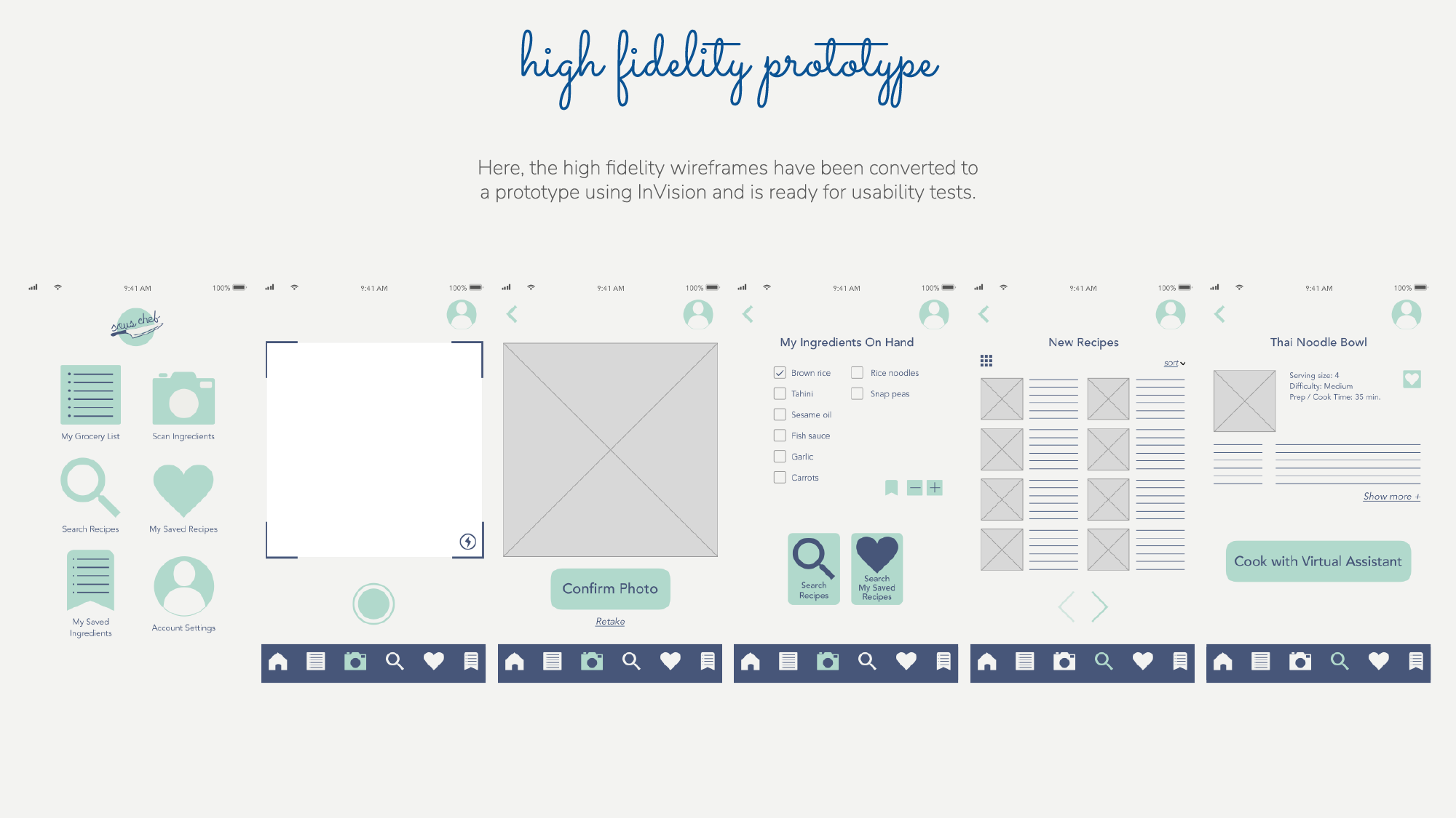
This project's goal was to develop an app that helps families discover and save recipes, find recipes based on ingredients they have on hand, create grocery lists to purchase, and prepare quick, healthy meals. I developed the app through user interviews, personas, low and high fidelity wireframes, and a prototype MVP.
I conducted user interviews with a few different families with young children. What they all had in common is that everyone wants to be able to cook healthy meals, but with both parents working, it is difficult. Some had tried Blue Apron or similar services, but found them to be inconsistent or too expensive. The ability to cook came up as well, which is an important aspect into creating this app.
I completed the interviews and used the information to create a persona. I compiled their frustrations and goals and gave the persona a back story that I took from real life.
After creating low fidelity wireframes, I began the process of creating high fidelity wireframes. These cards were set up to show the screen flow starting at the home screen and moving through the camera feature.
Once I felt the high fidelity wireframes were ready and the screen flows made sense, I created a prototype MVP using InVision. I feel that this would be a great app for young families and anyone who wants to be able to cook quick and healthy meals from scratch. It can keep track of the ingredients one has on hand and find recipes based on those ingredients. It would be a great and inexpensive alternative to companies like Blue Apron and the like.

Click or tap to view prototype
Landing Page

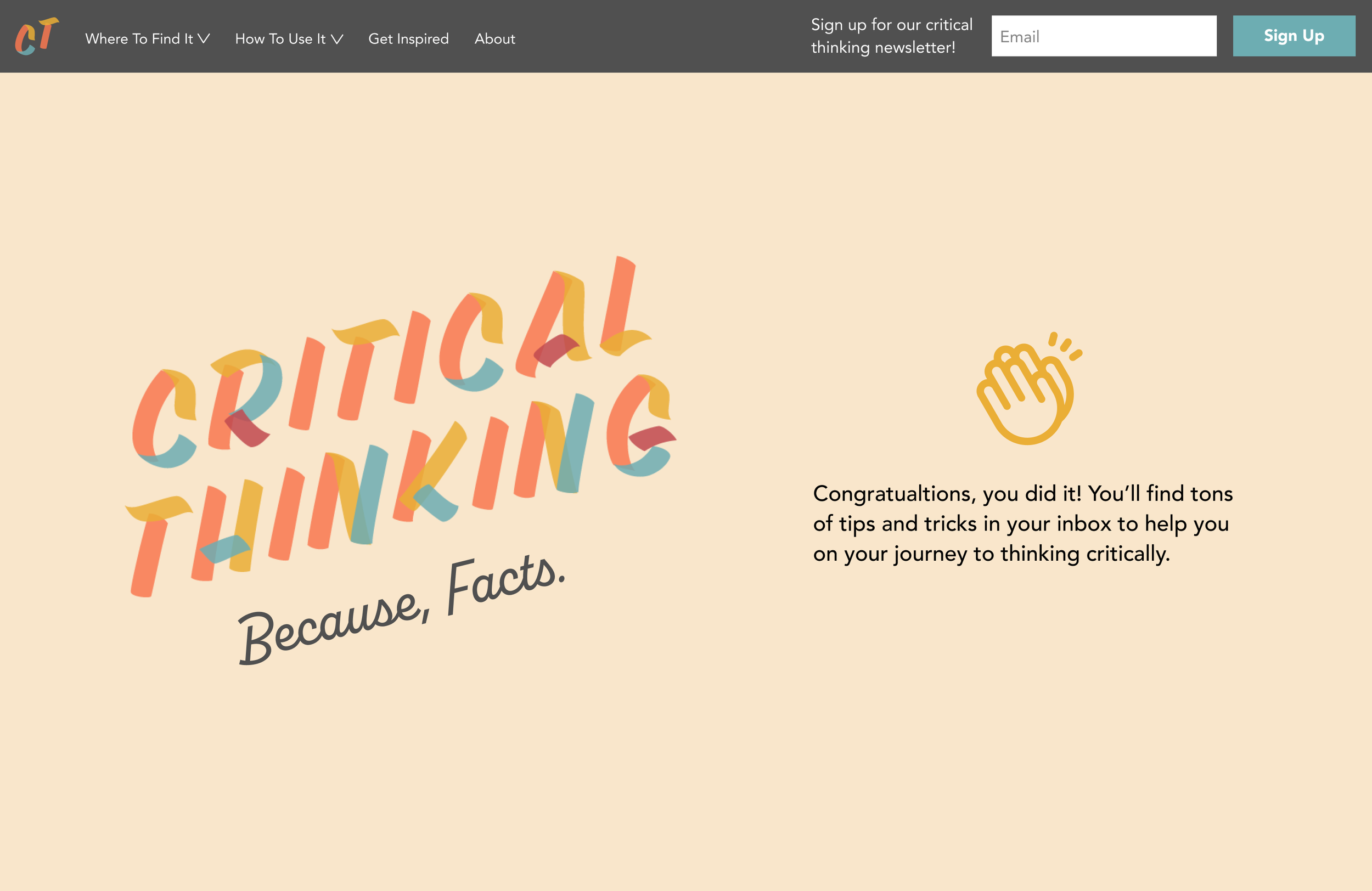

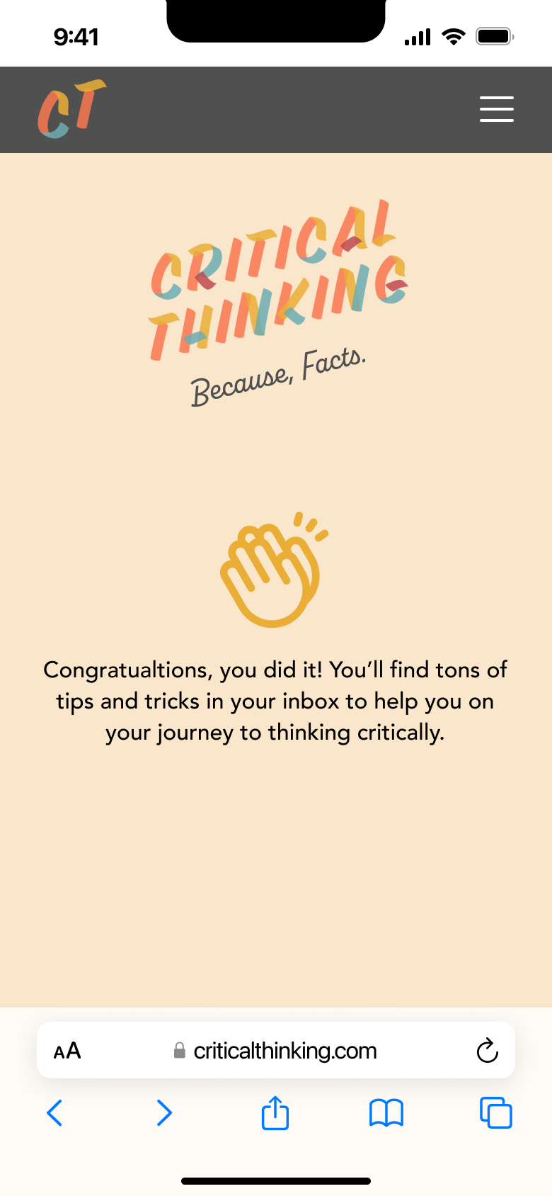
I created this landing page for a fictional website devoted to educating people in how to think for themselves and understand facts. Critical thinking is sorely lacking in our society these days. I thought it would be interesting if there were a site where a person who believes in “alternative facts” and “fake news” might stumble upon. Or, perhaps the person began to question the information they were getting and needed to learn how to tell fact from fiction or truth from a lie.
Both the desktop and mobile landing pages show a confirmation page once the user submits their email.

Click or tap to view prototype

Click or tap to view prototype